Two Bolds Don’t Make it Right or Do They?

We’ve all heard the expression two wrongs don’t make a right. But at times the joining of two strong things makes a powerful statement.
I primarily design homes and apartments in New York City and its surrounding areas where, as most know, everything is bold. The infamous smells, sounds, and visual influences are known for being ‘in your face’. That is also why many New Yorkers are considered to have that same ‘in your face’ personality.
When two New York City clients approached me about their plan to combine households, I was, of course delighted. However, I knew their individual tastes were on opposite sides of the decor spectrum let alone the color spectrum. Blue and red; sort of similar to their personalities. As they both share a love for strong color and purposeful appointments in their home, I was assigned the task of coordinating their individual looks within their new space conjoining blue and red.
Ironically, I had done work for both of their opposite considerations but his, blue, and her red presented a challenge.
How to Join Them?
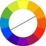
First, blue and red do in fact go together or match, if you will. When finding compatible color matches using the basic color wheel, we normally draw a line directly across the wheel to the opposite side. However, when looking at the color wheel and using a balanced triangle, red, blue, and yellow prove that they can be combined to create a fantastic array of options.
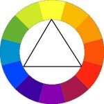
Blue and red (or stronger colors together) will normally create a bright, modern look and feel, but in the case of my specific assignment, the couple was looking to use the colors for a more traditional style. Using the said ‘triangle method’ and my knowledge of their personal tastes, I put together a bold statement of color and décor that is not only please to the eye, but also pleasing to the client.
It Ultimately Worked
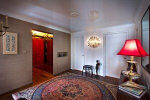
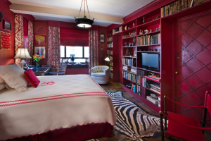
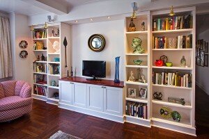
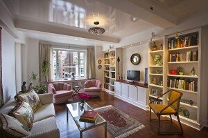
In this particular decorating scheme I used the combination in a bold sense a la the entry with an ‘in your face’ red door and blue patterned area rug. The red guest bedroom’s original design was created in the 70’s by a very famous designer. Since the first iteration was so wonderful, I simply repurposed some of the room’s original appointments. When designing the den area, the colors are presented in a more subtle way, with simple red and blue accents including red mini printed chairs and a blue vase.
A bold choice for bold individuals- creating color and style that meld beautifully exceeding both client’s expectations and proving two bolds do make it very right.