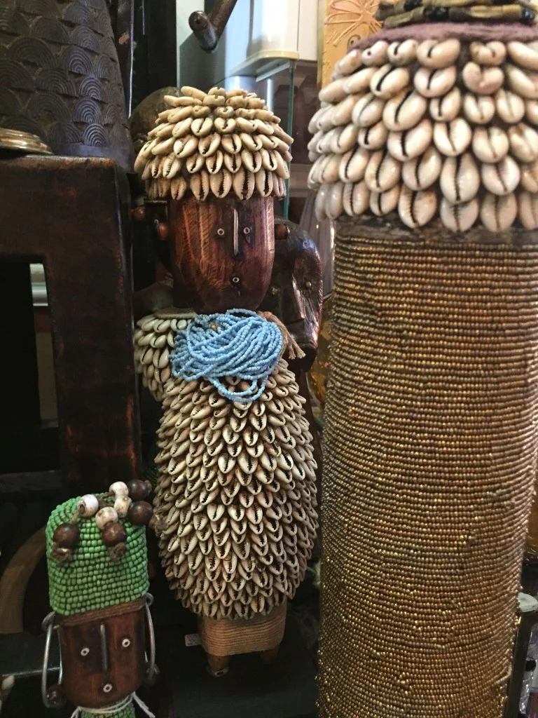
Influences Charlene KeoghApril 24, 2017General Information, Interior Design, Out and About, Uncategorized
Untamed Charlene KeoghApril 8, 2017General Information, Interior Design, Out and About, Uncategorized
Color Can Be Soulful Charlene KeoghMarch 27, 2017Color Color Color and Some More, Interior Design, Out and About, Uncategorized
Learning to Love Leather Charlene KeoghFebruary 1, 2017General Information, Sustainable Material, Textiles
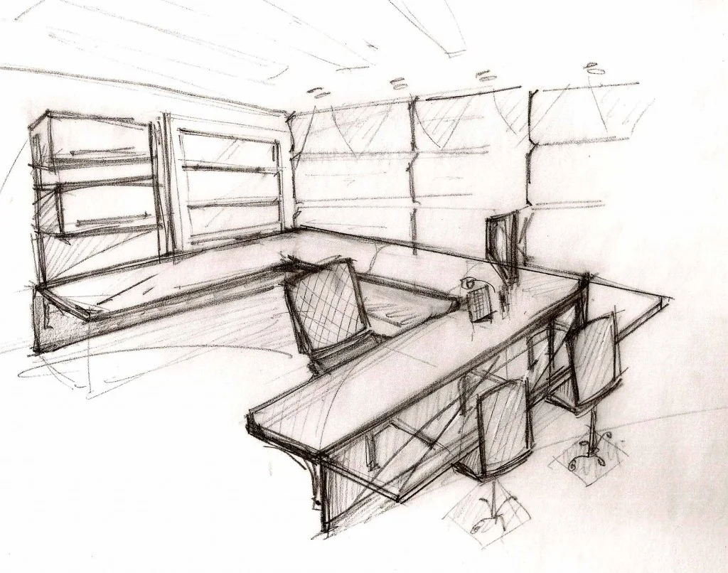
Knowing The Space – The Craftsman in Me Charlene KeoghFebruary 12, 2016About Charlene, Clients, General Information, Interior Design, Traditional Design
Collaborative Spirits Charlene KeoghJanuary 20, 2016About Charlene, Clients, General Information, Interior Design, Testimonials